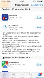
To follow-up the article “Why not to buy Nissan Leaf or Grundig Television”, Nissan actually released a brand new app to the iPhone now. I think it’s appropriate to mention a few words about their new app, since I wrote that this was one of the reasons why not to buy a Nissan Leaf.
Why Carwings was a problem?
I recommend to read my first article, but this is the highlights of the Carwings-part:
- GUI has not been updated for 5 years
- Unstable
- Slow
- Buggy
What is new?
Brand new GUI for the iPhone (Not sure about the other phone-brands)!
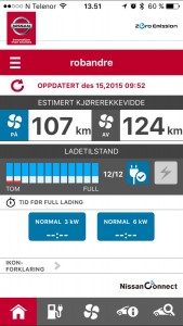
They have also rebranded Carwings to Nissan Connect… I think. The app is named Nissan EV, the app-icon has the “Zero Emission” logo, the startup-screen has a “Nissan Connect” logo.
Inside the app, the “Zero Emission” logo is written in the top and “Nissan Connect” logo at the bottom – both taking up a lot of unnecessary space on the screen.
So, let’s talk about the app and its design (GUI)
The GUI has a more modern design and nice colors – But it’s probably one of the worst app’s I have ever seen. Nissan should really fire some employees soon!
Why don’t they just ask the users what they use the app for? I would think the main reason people use the app is to see the battery-status and turn on/off climate. The battery-status is just a small illogical bar on the screen. Climate is hidden under a menu.
They also have two icons (boxes) a side of the battery-bars. On showing if the charge-cable is plugged in and if it’s charging or not. I would think these two icons could be combined to one box with different icons.
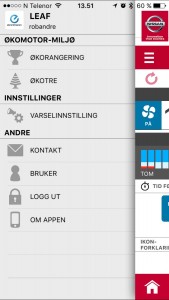
There is also a navigation button at the top, and a navigation menu at the bottom. Why use two navigations?
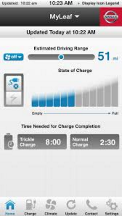
When googling the new app, I actually found a picture of a Nissan app. Not sure if this picture is a real app (Nissan or third-party) or a mockup, but it’s far better than the mess of an app I got on my phone.
Doesn’t this app look a lot cleaner and better?
The web-page still has the same old ugly GUI.
Stable / Unstable?
Carwings actually got more stable and almost reliable before this app update, so they have probably done something in their backend.
Slow?
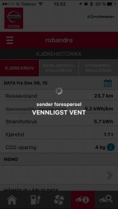
Yes, it’s still really slow. I used about 20-30 second to enter the app when it’s closed, this is without waiting for the car-data. The app also need to fetch some kind of data for every menu-item you click on. Not sure what the app has to load, as it’s not updating the car-status.
Buggy
I referred to a specific bug on the web-page and also how slow it was. The web-page is still the same.
Conclusion
Nissan, get yourself some designers! …and if it’s possible, some engineer’s who can speed things up a few seconds.

